
You’ve been in a hotel room. You’ve seen the art. Maybe it’s a vaguely geometric composition in soothing neutrals. Maybe it’s a blurred photo of a forest. Maybe it’s a large-scale painting of… something floral? Avian? Ambiguous?
Guess what? That was us. We made that.
And we made it under very specific conditions:
It must be “inoffensive.”
It must be “restful, but engaging.”
It must not depict: people, animals, politics, nudity, identifiable objects, sharp corners, or any discernible emotion.
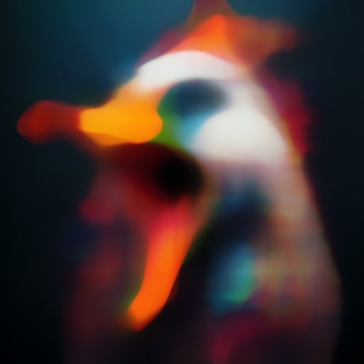
This is how we end up creating things like “Serenity No. 7”, a tranquil blend of brushstrokes that looks vaguely like a horizon but also could be a landscape as seen through a steamed-up shower door.
But here’s the weird part:
People notice hotel art. They take photos of it. They critique it. One hotel manager once forwarded me a guest review that read, “Loved the pillows, but the abstract over the bed looked like a screaming duck.” I had to admit… it kind of did.
So the next time you lie in a king-sized bed staring at an abstract painting wondering, “Why is that there?” – just know there’s an artist somewhere, sitting at home, hoping it’s still straight on the wall.